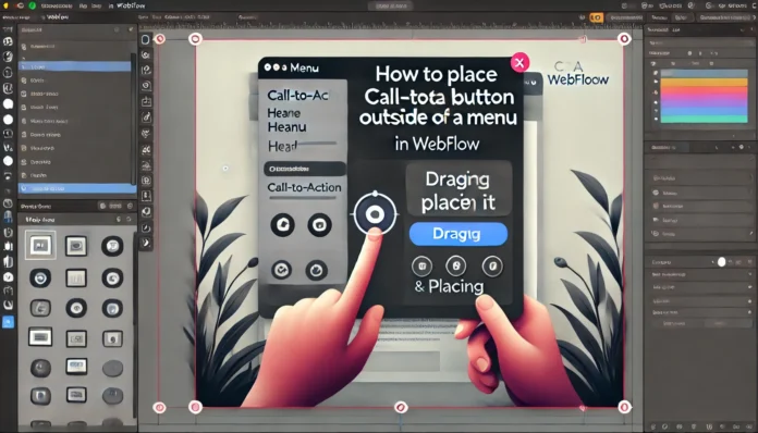
If you’ve ever scratched your head wondering, Webflow how to make CTA button outside of menu?, you’re not the only one. Many designers and developers want to create websites that look clean, professional, and, most importantly, convert visitors into customers. One trick to achieve this is placing a call-to-action (CTA) button outside the navigation menu. Let’s dive in and figure out exactly how you can pull it off with Webflow.
Why Place a CTA Button Outside the Menu?
Before we jump into the steps, let’s address the obvious question: why do this in the first place? It’s simple: CTAs are critical for driving user engagement. When you place a CTA button outside the menu, it becomes the most noticeable element on your navigation bar.
Here’s why this works:
- Attention-grabbing: It isolates the action you want users to take.
- Cleaner design: Avoid overcrowding the navigation menu with extra elements.
- Better focus: Guides visitors toward your desired goal, like signing up or purchasing.
Think of it as the cherry on top of a beautifully designed website. It’s the one thing you want users to notice and click.
Step-by-Step Guide: Webflow How to Make CTA Button Outside of Menu
Creating a CTA button outside the menu in Webflow might sound tricky, but it’s surprisingly straightforward. Follow these steps to get it done.
Step 1: Add the CTA Button to Your Navbar
Start by adding the button element directly inside your Webflow navbar.
- Open your Webflow project.
- Go to the Navigator panel and locate the Navbar component.
- Add a Button element inside the Navbar but separate from the menu links.
- Give it a clear name like
CTA-Buttonto keep things organized.
Step 2: Style Your Button for Visibility
This step is where your creativity shines. Design the button to stand out without clashing with your website’s overall theme.
- Set a bold background color (think bright red, green, or blue).
- Adjust the size, padding, and font to make it easily readable.
- Add a hover state for a touch of interactivity.
A good example would be an “Apply Now” button that lights up slightly when users hover over it.
Step 3: Move the Button Outside the Menu
Here’s the magic moment: moving the button out of the menu area.
- Select the
CTA-Buttonelement. - In the Style panel, change its position to
AbsoluteorFixed. - Use the positioning tools (top, bottom, left, or right) to move it outside the menu.
For example, you can place it aligned with the menu but floating on the far-right edge.
Step 4: Make It Responsive
One of the biggest challenges in Webflow is ensuring your design works on all screen sizes.
- Switch to the Tablet and Mobile views in Webflow’s Designer.
- Check how the button behaves with the responsive layout.
- Adjust margins or switch to
Relativepositioning if needed for smaller screens.
Real-Life Example: A Button That Works
Imagine you’re building a website for an online course. Your navigation bar includes links like “Home,” “Courses,” and “Contact.” But what do you want users to do most? You want them to sign up.
By placing a bright “Enroll Now” button outside the menu:
- Users immediately see the action you want them to take.
- It separates from the menu clutter, making it easier to spot.
- You subtly guide visitors toward your goal without overwhelming them.
FAQs: Webflow How to Make CTA Button Outside of Menu
Q: Can I add animations to my CTA button?
A: Yes! Webflow makes it simple to add hover effects or micro-interactions. Try adding a slight bounce or glow when users hover over the button to make it pop.
Q: What if my button looks out of place on mobile?
A: Adjust its positioning for mobile views. You can shrink the button, center it below the menu, or use a smaller CTA label like “Join.”
Q: Can I have more than one CTA button outside the menu?
A: You can, but keep it minimal. Overloading your site with too many CTAs might confuse users and dilute their impact.
Q: Do I need custom code for this?
A: Nope! Webflow’s Designer tools handle everything without the need for custom code. However, advanced users can enhance functionality with custom CSS or JavaScript.
Tips for Optimizing Your CTA Button
To make your CTA button even more effective, here are some additional pointers:
- Use action-oriented text: Instead of “Click Here,” go for “Get Started” or “Try Free.”
- Keep it simple: Don’t clutter your button with too much text.
- Add contrast: Make sure the button color contrasts with the background to ensure it stands out.
- Test different positions: Play around with button placement until it feels natural.
Benefits of Using Webflow for This Design
What makes Webflow perfect for creating a CTA button outside the menu? Here’s why:
- Ease of use: Drag-and-drop design with pixel-perfect control.
- Flexibility: You can customize everything without relying on templates.
- Built-in responsiveness: Webflow automatically adjusts designs for all screen sizes, saving time.
Whether you’re building for a personal project or a client, Webflow’s intuitive tools let you experiment with creativity and practicality.
Final Thoughts on Webflow How to Make CTA Button Outside of Menu
Learning how to create a CTA button outside the menu in Webflow doesn’t just improve your design—it boosts user engagement. A well-placed button can be the difference between a visitor bouncing off your site and completing a purchase, signing up, or taking the next step.
By following these steps, you’ll create a navigation bar that not only looks great but also drives results. Don’t hesitate to experiment with different button designs, placements, and styles to find what works best for your website.
Remember, when it comes to designing in Webflow, how to make a CTA button outside of menu is just one skill in your toolbox. Apply what you’ve learned, and watch your conversions grow.


